Lightroom tutorial. How to create a mood in a photograph by making it low-saturated
How to add mood to a photo. 8 simple tips
With modern digital cameras, it's easy to take a well-exposed photo. But how can you convey in a photograph the mood and emotions that you felt when you decided to take this picture?
In today's article, we'll talk about several techniques that you can use to add mood and emotion to your photos.
There are several methods for expressing how you feel about your surroundings. All of them include the author’s creative approach - after studying these methods, you will stop just “taking pictures” and start taking photographs.
It all starts with choosing what you want to shoot. Just because you can take a photo doesn't mean you should. Good photographers are selective about what they shoot. And you should also follow this advice - then your work will improve.
For example, you find a beautiful place, but you find yourself there right in the middle of the day and you know that the light is not falling in the best way.
Returning later in the evening or early morning, when the sun is low in the sky and there is nice, even light, will give you a real chance to take a good photo.
This technique alone will greatly improve your work. But most photographers already know this. So here are a few more ideas to help you.
Use an open aperture
Try using an open aperture on your lens. If you are using zoom lenses, this will be between f2.8 and f5.6. This technique works best with prime and telephoto lenses, as they have a shallower depth of field.
The idea is to focus on the subject and remove the background from the focus. The most common method used in portrait photography is to focus on the subject's eyes and use an open aperture so that part of the face and background are out of focus.
A blurred background creates interest and prevents us from seeing what should be there. We are forced to use our imagination to fill in these gaps. The technique works best when the background is darker than the subject - shadows create mood better than bright highlights.
This photo was taken with an 85mm f1.8 lens. I used a macro lens to get a closer look at the dandelion. The combination of a wide aperture, minimum focusing distance, and telephoto lens results in a very shallow depth of field that throws the background completely out of focus.
Take photos in low light
Try taking photos when the lighting is low. Low light is more sensual and creates the right mood. When photographing static subjects such as landscapes, it is best to place the camera on a tripod and use a timer or remote control to prevent camera shake.
If you're shooting something moving, like people, you'll need to use a high sensitivity and a wide aperture to get the shutter speed fast enough to avoid camera shake. Don't be afraid of high sensitivity - noise will help create the mood in the photo, just like grain in the days of film photography.
In low light, you can also use a slow shutter speed to add blur to your photos. This is another way to create an image with a mood.
You can experiment with manual exposures of about two seconds - take a look at Chris Friel's landscapes and you'll see what we're talking about.
This photo was taken at dusk in Potosi, Bolivia.
Setting the Color Temperature
Shoot in RAW format and set the desired color temperature in post-processing. This means you can determine the optimal color temperature later and don't need to adjust it correctly on camera.
This also gives you another significant advantage - you can create more than one interpretation of the image. Your RAW file is just a starting point, like a negative in the hands of an experienced black and white photo developer.
Take a look at the following photos. They were produced from the same RAW file, but with different color temperatures. One has warm tones, while the other has a cool palette.
Both photographs convey the mood very well, but in each photograph it is completely different.
Portland Bill, Dorset, UK: Processed in cool tones.
Portland Bill, Dorset, UK: Treated in warm tones.
Use backlight
Backlighting is one of the most effective types of lighting for conveying mood. It works because the exposure range is beyond your camera's capabilities.
There are several approaches - you can adjust the exposure to the light source (usually the sun in the sky, but it could be a flash in the studio or a window indoors) and if the light source is strong, then everything in the foreground will become a silhouette or semi-silhouette.
Another way is to expose the foreground so that the background will be overexposed. Two different techniques, two different moods.
The third method is to shoot backlit and use the flash to illuminate the subject from the front or side. This method is used when you don't want to overexpose the background too much, but also don't want to lose detail in the foreground by turning it into a silhouette.
Avoid HDR (high dynamic range) techniques for backlit shots if your goal is to create a mood.
The mood is created when the details in the photo are complemented by the viewer's imagination. HDR photos provide all the details and leave nothing to the imagination.
San Antonio de los Cobres, Argentina. See how the backlight sets off the smoke and makes the people stand out in the photo? You wouldn't get this effect with any other type of lighting.
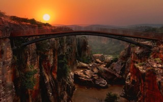
Sunset and sunrise
Shooting sunsets is potentially one of the most overused clichés in photography. But do it well. And this technique will help you take incredibly beautiful landscape photographs.
It works best when there is water in the photo. This is because a beautiful sunset paints the sky with amazing colors that are reflected in the water.
The light of the setting sun is very warm. If you're photographing a sunset, look around and see what's being illuminated by the sun. This way, you can find shots that turn out better than the sunset itself.
The best light comes just after the sun has set. Especially if there is water reflecting colors in the sky.
If you've been at sea all day and found a beautiful place, imagine what it will look like after sunset. Photos almost always look better in this light, and it's worth coming back in the evening to take photos.
You can also shoot at sunrise. At this time, the light has a completely different quality because the air is cleaner and the colors will be different. But you will need to get up very early.
Colonia del Sacramento, Uruguay. The colors of the sunset are reflected in the water.
Tip: Photographer Ephemeris is a free application for Windows , Mac and Linux that calculates sunset and sunrise times anywhere in the world.
Use a long shutter speed
We're talking about a really long exposure - two seconds or more. This is a technique for landscape and night shots. Make sure your camera is on a tripod and use a timer and mirror lock-up to avoid camera shake. In windy conditions, stand between the wind and the camera.
Long exposures work best when there is something moving in the photo, such as the sea, the flow of a waterfall, or grass in the wind. Moving objects contrast with static elements of the landscape. You can combine this technique with low-light photography or shooting during or after sunset.
It is also effective to take photos of cityscapes with moving cars taken in the evening. The light from the cars will leave a path.
Take these photos when there is still light so that it remains in the sky. Then the sky will turn out dark blue, not black.
San Antonio de Areco, Argentina. The long exposure captured the lights of passing cars as light trails.
Convert to black and white
Black and white photographs are a classic way to set the mood. This method is best used in combination with others. The idea is to make your mood photo even more expressive by converting it to black and white.
Once you've transformed your photos, you can enhance them using toning. Sepia works well for landscapes and portraits. Blue tones are suitable for subjects with cold scenes - such as winter landscapes.
This shot of a flower has been converted to black and white and toned. The contrast of the white flower against the dark, defocused background helps set the mood.
Add textures
Adding texture is a good way to create moody photos. You can combine this with conversion to black and white and tinting.
Just like when converting photos to black and white, it's important to start with a photo that already has the mood in mind. The goal is to go as far as you can and see how great a photo you can come up with.
Use this technique selectively. This doesn't work for every photo, and if you add texture to all your photos, it will soon become boring. Ideal subjects include portraits, nudes, still lifes and some landscapes.
How to add texture to your photo? You will need Photoshop or another editing program that supports layers. You simply paste the texture as a new layer onto the original photos and then adjust the opacity and layer blend modes to get the effect you want.
You can apply textures to part of a photo. For example, for the background. This can be done by adding a new layer in Photoshop, then erasing the parts where you don't want it. The method is good for portraits - you can apply texture to the background, but not to the face.
Texture has been selectively added to the photo and removed where it obscures the model's face.
Add some mood!
Combine several techniques and the result will be a photo with a mood that you can be proud of. Do you already have an example you'd like to share? Feel free to leave a link in the comments!
Lightroom tutorial. How to create a mood in a photograph by making it low-saturated
Often during processing, our thoughts are occupied with what else we can add to our images to make them more impressive; more sharpness, contrast or color. But this is not always the best way. The old saying “Less is more” can be applied to many aspects of photography, and this is especially true when it comes to color.
Desaturated images are becoming more and more popular, especially for nature, landscapes and street photography. Counterintuitive as it may seem, removing color saturation can be more effective in some cases than adding it. But that being said, there's more to it than just working with the saturation and vibrancy sliders in Lightroom or ACR.
In this article, I will walk you through all the necessary steps to create a low saturation image in Lightroom. It's very simple and will help you add uniqueness to your images. But first, a little knowledge that you need to understand before you start editing your photos.
What is Saturation?
This may seem like one of those typical “Gotta go without saying” situations, but have you ever thought about what saturation actually means and how it affects your image? In relation to photography, saturation refers to the overall intensity of a color. Technically, saturation can be thought of as the difference between white and the rest of the colors in the spectrum.
In our case, saturation is the depth of colors present in the photo. The intensity of color in an image can be controlled overall (affecting the entire photo) in a variety of ways: Saturation slider, HSL panel, tone curve. You can also change saturation selectively only in certain areas using filters and a brush. Finally, saturation settings apply to all colors regardless of their brightness.
Saturation +100 applied - note the histogram here.
What is Juiciness?
Juiciness is a slightly more interesting concept. Adobe used this term to mean something very similar to saturation. The difference between saturation and vibrancy is always black and white (color joke), but there is a difference.
The Saturation slider adjusts the intensity of all colors in the entire image, regardless of their brightness. This means that all colors whose brightness falls in the highlights, midtones and shadows are affected. Vibrancy is different in that it only affects colors that fall within the midtone range. It refers to "smart" saturation, and I tend to agree with that. Vibrance is very useful for enhancing, or in our case weakening, colors throughout an image without being as harsh as the Saturation slider.
+100 Vibrance – Notice the difference between this histogram and the one that shows saturation.
When does low saturation work best?
Bright colors are used in photographs where the intention is to bring a more optimistic and cheerful mood. This doesn't mean that all desaturated images have to be sad or devoid of joy, in most cases just the opposite. The purpose of desaturated, muted tones is not to dampen the spirit of the photo, but rather to enhance the mood. However, photos that often look best when desaturated are those that convey a sense of reflection. Images that best correlate with desaturated colors include, but are certainly not limited to:
- Mood portraits
- Rough outdoor photos
- Cityscapes
- Emphasizing chilly weather conditions such as rain, fog or haze.
Now that you've had the patience to sit through the "why," we move on to the "how."
How to Effectively Desaturated an Image
Most often, the decolorization process itself is carried out using the Vibrance slider, not Saturation. The important thing is to make the image desaturated, but not flat or completely colorless. There should almost always be splashes of color that need to be emphasized. As with other aspects of photography, less can actually be more. Don't remove color altogether and work with colors that will enhance the photo. It's a matter of harmony here.
We start working with the RAW file straight from the camera.
Now we have the same image, tidied up a bit using the Adobe Lightroom Basic Panel settings. I also used the ND filter tool to balance the exposure of the sky, buildings and water. Then I added +45 haze removal.
Now that we have completed our basic settings, we can begin the desaturation process. I find it best to save all saturation settings until the end of the editing process. Please remember that there are endless ways and ways to apply bleach, so use your creativity in this part.
Find the Appearance section of the Basic Adjustments panel in Lightroom.
For this image I applied a saturation of -40.
This made the entire photo significantly desaturated.
The decolorization itself makes the image look a little flat. To counteract this, let's increase the juiciness to +25.
Remember that vibrancy only affects colors in the midtones. In this case, blue, orange and yellow shades are enhanced. This makes them stand out more throughout the image, adding a bit of pop.
This is where things get interesting. Instead of just leaving the image desaturated, we'll use some advanced features to give it full control to make it pop.
To do this, we'll go back to the Curves panel. A tone curve is a graphical representation of the brightness present in an image. If you've ever seen a vintage style photo, chances are some editing was done using this technique. What we want to do is fade the image a little to add a blurry feeling. Basically the blacks will be brightened and the highlights will be boosted. This creates an S-curve that looks something like the following image:
This one gives us a kind of faded effect.
The buildings and water still look a little monotonous, so to add some color intensity we'll turn to our old friend, the gradient filter. This will give more color where it's needed without affecting the rest of the image.
Now our photo is significantly different from the one we started with a few minutes ago.
The difference is quite obvious when compared to the original RAW file.
Desaturating a photo goes much further than simply removing color. Sure, you can move the sliders to the left and move on, but why not take it to the next level and really make it unique? Remember these key points:
- Work with RAW files to get maximum dynamic range.
- Make all the basic adjustments such as exposure, contrast and clarity.
- Don't go too far with the bleaching.
- Use a tone curve to add atmosphere.
- Make final edits to the finished image using local adjustments like a gradient filter or an adjustment brush.
It's important to remember not to underestimate the power of your photos. Take time to experiment with different effects until you find something you really like. It may be something completely different than you expected.
Here are some more examples of images processed using desaturation:
8 methods to add mood to a frame
With modern digital cameras it's easy to get a well-exposed photo. But how can you take it a step further and create an image that captures the mood you were in when you took it? In this tutorial I'm going to look at some techniques you can use to bring mood and emotion to your photos.
There are several methods by which you can express the feelings that a scene evokes in you. They all require creative input from the photographer - by exploring these techniques you will stop "getting" images and start "creating" them.
It all starts with being selective about what you shoot. Just because you can take a photo doesn't mean you should take one. Good photographers are selective about what they shoot. You should be the same and your photos will be better.
For example, you find a beautiful place that you would like to photograph, but you find yourself there at midday and you know that the lighting is not optimal. Going back in the afternoon or early morning - when the sun is low in the sky and a nice side light illuminates the scene - will really enhance the shot.
This technique alone will seriously improve your photography. But most photographers already know this, so below are some more ideas for you to think about.
Step 1: Use a wide aperture
Try using the widest aperture on your lens. If you are using zoom lenses, this value will be between f/2.8 and f/5.6. This technique works best with normal and telephoto lenses because they have a shallower depth of field.
The idea is to focus clearly on your subject and keep the background out of focus. This technique is often used in portraits - focusing on the subject's eyes and using a wide aperture to blur part of the face and background.
The background, taken out of focus, gives the photo a mood, since we cannot understand what it should be like. We must use our imagination to fill in the gaps. The technique works best when the background is darker than the subject - shadows look more emotional than bright highlights.
This photo was taken with an 85mm f/1.8 prime lens. I used a macro lens to get closer to the dandelion. The combination of a wide aperture, a close focusing distance and the use of a telephoto lens allows you to achieve a very shallow depth of field that completely removes the background from the focus area.
Step 2: Shoot in low light
Try shooting in low light conditions. Low light gives a photo a mood and evokes memories. If you're shooting static subjects, as is the case with landscapes, you can place the camera on a tripod and use a cable release to avoid camera shake.
If you're photographing moving subjects, such as people, you'll need to use high ISOs and a wide aperture to ensure your shutter speed is fast enough to avoid camera shake. Don't be afraid of high ISOs—noise can add mood to your photos, just like grain can with film.
In low light conditions, you can also use slower shutter speeds to create blur in your images. This is another way to bring mood into the frame. Andrew F is good at this.
You can experiment with handheld shooting at long shutter speeds (around 2 seconds) - take a look at Chris Friel's landscapes to see what I mean.
This shot was taken at dusk in Potosi, Bolivia.
Step 3: Adjust Color Temperature
Shoot in RAW and adjust color temperature in post-production. This means that you can decide the optimal color temperature later and don't have to worry about setting it correctly in your camera.
This also gives you another significant advantage - you can create more than one interpretation of an image. Your RAW file is just a starting point, more like a negative in the hands of an experienced printer in a dark room.
Take a look at the following photos. They are created from the same RAW file, but with different color temperatures. One has very warm colors, the other is decorated in a cool palette. Both shots have a wonderful mood - but the mood in them is completely different.
Portland Bill, Dorset, UK: processed in cool tones.
Portland Bill, Dorset, UK: processed in warm tones.
Step 4: Shoot in the Light
Backlighting is a very bright and dramatic type of lighting. This method works because the exposure range is beyond the values the camera can handle. There are several approaches - you can set the exposure to the light source (usually the sun in the sky, but it can also be a flash in the studio or a window indoors) and if the source is strong enough, the subject in the foreground will appear as a silhouette or semi-silhouette .
Another approach is to expose for the foreground, which will overexpose the background. Two different techniques, two different moods.
A third approach is to take a backlit portrait and use flash to illuminate it from the front or side. The technique is used when you don't want to overexpose the background, but still want to show the detail in the subject's face.
To take mood photos, avoid HDR techniques in backlit situations. You create a mood when there are gaps in the image that need to be filled in using the viewer's imagination. HDR photos show every detail, leaving no room for imagination.
San Antonio de Los Cobres, Argentina. See how backlighting gives off smoke and creates halos of light around the people in the photo? You won't be able to get this effect with any other type of lighting.
Step 5. Sunset and sunrise
Photographing sunsets is potentially one of the most boring clichés in photography. But if you know how to do it well, you can use this technique to create incredibly beautiful landscape photos.
This method works best when there is water in the frame, as the beautiful lighting at sunset turns the sky into stunning hues that reflect off the surface of the body of water.
The light from the setting sun is very warm. If you're photographing a sunset, make sure you look back to see what the sun is shining. Perhaps this shot will be even better than the sunset itself.
The best lighting occurs when the sun has already set, especially if there is water in the frame that can reflect the color of the sky.
If you are by the sea during the day and find a beautiful place, imagine what it will look like at sunset.
It's almost always better, and it's worth coming back in the evening to shoot. You can also take pictures at dawn. The light has a different quality at this time because the air is more transparent and the colors will be different.
Colonia del Sacramento, Uruguay. The shades of the sunset are reflected in the water.
Step 6: Use Long Exposure
I use really long shutter speeds - two seconds or more. This technique is good for landscape photographs. Make sure the camera is mounted on a stable tripod, and use a cable lock and mirror lock to prevent camera shake. If it's windy, stand between the camera and the wind.
Long exposures work best when there is something moving in the frame, such as the sea, water in a waterfall, or grass blowing in the wind. The moving elements of the scene contrast with the stationary ones. This technique should be combined with low-light photography and shooting at or just after sunset.
This is also effective in cityscapes shot in the evening with moving cars in the frame. Car lights will leave light trails. Use this technique when there is still light in the sky so that it retains its hue - more dark blue than black.
San Antonio de Areco, Argentina. Using a long exposure, we were able to capture the lights of passing cars as streaks of light.
Step 7: Convert to Black and White
Black and white photographs create a mood. This technique is best used in conjunction with the others listed in this article. The idea is to make your already moody shots super moody by converting them to black and white.
Learn how to convert your photos to black and white here: 7 Techniques for Converting to Black and White in Photoshop.
Once you've already converted your photos to black and white, you can add extra mood to them by toning them.
Sepia tones work well for landscapes and portraits. In blue shades - for objects with a feeling of cold, such as winter landscapes. Learn how to tone your black and white photos here: Mastering the Art of Toning Black and White Shots .
I converted this photo of a flower into a black and white frame and tinted it. The contrast of the white flower with the dark, out-of-focus background helps set the mood.
Step 8: Add Texture
Adding textures is a good technique for creating moody photos. You can combine it with black and white conversion and toning. As with converting to black and white, it's important that you start with a photo that already conveys a mood. The goal is to go as far as you can and see how interesting you can make your shot.
Use this technique selectively. It doesn't suit every photo, and if you add texture to all your photos, it will soon become boring. Ideal subjects are portraits, nudes, still lifes and some landscapes.
How to add texture to your photos? You need Photoshop, or another image processing program that supports working with layers. You simply paste the texture as a new layer on top of the original image, and then adjust the layer's transparency and blending mode to get the effect you want.
You can also apply textures to just part of an image, such as the background. This is done by adding the texture to a new layer in Photoshop, and erasing the unwanted parts. This is a good technique for portraits - you can use texture in the background, but not on the face.
I selectively added texture to the frame by removing some of the texture layer where it covered my model's face.
Create the mood!
Combine some of these techniques and the result will be a shot with a mood, a shot you can be proud of. Do you have an example you'd like to share? Feel free to add the link in the comment below!
Article author: Andrew Gibson
Winter presets for Lightroom
Nowadays, quite a lot of designers and ordinary users choose the Lightroom program (Adobe Lightroom) to work with photographs. Firstly, it allows you to retouch and process photographs, and secondly, it can be used to quickly organize a catalog of images. At the same time, you can also find special lessons on Lightroom and additional tools for it, in particular, presets, on the Internet. These are a kind of blank parameters (contrast, color) and effects for color correction and image enhancement. Today’s post is dedicated to the topic of processing winter photos in Lightroom, or to be more precise, we’ll look at special Winter presets for Lightroom.
This tool allows you to quickly change the look of your photo with one click. Essentially, it's very similar to Photoshop actions. With winter Lightroom presets, you can create beautiful atmospheric photos by changing the lighting, adding snow, etc.
The main advantages of using it are automation of image processing, improved speed and efficiency. Yes, you could easily process winter photos manually in Lightroom or Photoshop, but how long would it take to implement 10-20 options? That’s why the function of winter presets, whether it’s winter or any other theme, is extremely convenient.
You can change the emphasis on image objects, create background blur, etc. When processing winter photos in Lightroom, a feature with predominant cold tones is often used. This adds a certain “frosty winter” effect to the picture.
And if you also apply here changing the brightness of the picture... For some types of photographs this may be a good solution.
I think the difference is visible to the naked eye. For each of your pictures, you can choose the appropriate solution to make it better. Moreover, implementation takes seconds. Here's what processing a winter photo in Lightroom looks like on video (using a set of winter Lightroom presets).
There is nothing complicated. After implementing one of the effects, you can change the settings of the photo in order to modify it in accordance with your requirements.
The set of winter presets for Lightroom 5 is also compatible with program versions 4, CC, SS 2015. It will work in both the English and Russian versions.
Now you can order a set with a 50% discount - for only 790 rubles. 20 different payment options are available: bank transfers, electronic payment systems, etc. After payment, you will receive a link by email where you can download winter presets for Lightroom. The volume of the collection is 33 MB .
As a bonus to regular materials you will receive:
- set of black and white effects;
- snow preset for Lightroom;
- video tutorials on application (for beginners).
The latter allows you to create a “winter mood” for almost any photo.
In general, in my opinion, this set is an excellent solution if you have to edit winter photos in Lightroom. More than 170 different effects + the ability to add snow. We combine all this with the basic capabilities of Lightroom and we get a great tool.
LiveInternetLiveInternet
—Categories
- Everything for Photoshop (447)
- decoupage (material) - weaving from newspapers - Master class (412)
- illustrations, paintings (303)
- a collection of photoshop lessons (264)
- photos (231)
- recipes (167)
- browsers, bookmarks, useful software (141)
- poems and just for the soul (138)
- everything for beauty (129)
- tips (115)
- useful links and sites (109)
- Tips and tricks for working on a PC (90)
- IDEAS FOR HOME AND Cottage (72)
- circuits (53)
- FLOWERS FROM Ribbons and PAPER (45)
- CANDY FLOWERS (42)
- erotica (10)
- Processing in Lightroom (9)
- Working in Word (9)
- Corel lessons (8)
- Camera settings (4)
—Tags
—Quotation book
THE SIMPLE WAY TO THREAD A NEEDLE! . Look how simple everything really turns out to be.
We make a decorative castle with our own hands. SOURCE .
Zucchini roll with minced meat Zucchini roll with minced meat is an elegant snack for every day and is decorated.
Blooming flower beds on your own plot The summer season is just around the corner, and that means...
Whitewashing of trees Whitewashing of trees in the country should be done in the spring before the leaves appear, in March.
—Music
—Applications
- I am a photographer Plugin for publishing photos in the user's diary. Minimum system requirements: Internet Explorer 6, Fire Fox 1.5, Opera 9.5, Safari 3.1.1 with JavaScript enabled. Maybe it will work
- Online game "Big Farm" Uncle George left you his farm, but, unfortunately, it is not in very good condition. But thanks to your business acumen and the help of neighbors, friends and family, you are able to turn around a failing business.
- Postcards Reborn catalog of postcards for all occasions
- always no analogues at hand ^_^ Allows you to insert a panel with an arbitrary Html code into your profile. You can place banners, counters, etc. there
- Download movies Download movies quickly
—Subscription by email
—Search by diary
—Statistics
Lesson in Adobe Lightroom and Adobe Photoshop: Portrait in honey tones
Wednesday, July 29, 2015 21:21 + to quote book
But, in fact, what we will work with and what result we will achieve:
Let's prepare the photo in Adobe Lightroom:
- Let's start by adjusting the white balance, you want to make the photo the warmest and most suitable in color
- Frame the photo using the golden ratio rule
- Adjust exposure, shadows and highlights
- Let's add noise
Next, let's go to Adobe Photoshop:
- Let's start with cleaning the skin and plastic parts of the model.
- Let's adjust the wreath on the head, add the missing central part from another photo
- Let's do vignetting to accentuate the model
- For toning we will use the Color Efex Pro plugin
- Let's apply additional curves and selective color correction
- Let's add texture
Step 1: Lightroom. Basic
I'm starting with Lightroom. Since the task before us is to make a portrait in a “honey” tint, we need a warm photo, and white balance will be just the tool that will help us. I’ll adjust the temperature towards yellow and move the shade towards green in order to get rid of slight redness on the skin. Immediately I will slightly increase the contrast, clarity and raise the black point, making the shadows lighter. In this case I will reduce the saturation to make the greens more muted.
Step 2: Framing is important!
Now let’s frame the portrait correctly, since now our gaze is glancing over the photograph and there is nothing for it to catch on. Let's use the golden ratio rule and place the line of intersection of the points at eye level, as shown in the picture. Yes! now it looks more like a portrait!
Step 3: Expand the dynamic range
To expand the dynamic range, namely to “pull out” information in shadows and highlights, I will adjust the photo in the black and white points respectively, turning them to positive (all parameters are shown in the photo below). Increasing the white point will emphasize the highlights, and the black point will bring out information in the shadow areas. I deliberately pull out the shadows because I want to reduce the exposure in order to get a more dimensional image. Next, I’ll add richness and a little noise, although I prefer the result of applying noise through the Color Efex Pro plugin, this is a note for you.
Step 4: Go to Photoshop. Cleaning leather and plastic
I always start by cleaning the skin and plasticizing the model. I remove minor defects with a restoring brush, cleanse the skin from various spots and wrinkles. Using a stamp, I copy the tooth, since one of them seems suspicious to me. Next, I create a layer for retouching using the Alt button held down, and in the window that appears, select the blending mode “soft light” and check the box next to “fill with neutral 50% gray color” (as shown in the picture) and use a brush with 10-20% opacity I begin to lighten and darken uneven areas of the model’s skin (this method of skin retouching is called Dodge and Burn).
These are the two gray layers I came out with (the first with smaller defects, the second - drawing large spots and volume).
Step 5: A Little Collage
I cut out part of our pseudo-wreath from another photo and insert it into our portrait by creating a mask and drawing the necessary areas, as follows:
I will adjust the wreath by color, using selective color correction, so that the greenery that was “inserted” matches the color of the already toned photo, parameters in the photo:
Step 6: Select the model and apply a “honey” tint
In order for the model’s face to be more expressive and attention to be focused on it, I create a vignette using a curve. To do this, I move the curve into the shadow, as is convenient for me, without making the photo contrast, create a mask and paint over the model’s face:
Now I’ll use the Color Efex Pro plugin and select the Cross Balance filter in it and set the warm tone to 70%.
Next, I'll adjust the photo using selective color correction and add a little matte to the shadows using a curve, raising it at the black point. That is, I simply pull the leftmost point up.
I will use the Color Efex Pro plugin again and this time I will select the Cross Processing filter, and in it the
LO3 25% function. I also used levels to make the photo more contrast, move the black point to the right and the midtones to the left, and also draw the necessary parts on the mask.
Step 7: Add Texture
Next, I add a sparkle texture that I found on the Internet.
I set the blending mode to screen to show the sparkles.
I add another bokeh texture, change it to red closer to orange, also set the blending mode to screen and adjust the texture using brightness and contrast so that it is slightly noticeable and does not overlap our portrait.
Next, I add a 25% green photo filter with 30% opacity, then sharpen the photo, blur the edges of the photo a little using Alien Skin Bokeh, and that’s it, the photo is ready!
After the photo is taken, you need to go relax a bit and drink some tea!
In order to come back a few minutes later and take a fresh look at the photo, since you are used to it, maybe you need to adjust something somewhere else, for example, I used plastic surgery again, slightly corrected the lips, removed the red color in the shadows, I added just a little yellow in the highlights, I did it all using color balance.