Lighting solutions and shadow patterns
Laws of chiaroscuro: from simple forms to portraits
To understand how to depict volume, beginners are taught to draw geometric shapes. But how to convey light and shadow on more complex shapes? For example in a portrait? Let's consider the laws of chiaroscuro using the example of drawings of various objects, including a drawing of a human head.
First a little theory
We see the world around us due to the fact that light is reflected from surfaces with different strengths. Therefore, we perceive objects as three-dimensional. To convey the illusion of volume on a plane, you need to learn how to depict chiaroscuro, which consists of:
Using the example of a drawing of a ball, a cube and a human head, you can see where the listed areas of chiaroscuro are located. But now more details about each.
- The highlight is the lightest part, which is a reflection of bright light: a lamp, the sun, etc. The glare is clearly visible on glossy (shiny) surfaces and is practically invisible on matte surfaces.
- Light - as the name suggests, this is the illuminated part of an object.
- Next comes the intermediate region between light and shadow - penumbra .
- Its own shadow is the darkest part of an object.
- At the end of the listed zones there will be a reflex . The word “reflex” comes from Lat. reflexus, which means reflection. That is, in our case, the reflex is reflected light in the shadow part of the object. It is reflected from everything that surrounds the object from the shadow side: from the table, ceiling, walls, draperies, etc. The reflex area is always slightly lighter than the shadow, but darker than the penumbra.
- A cast shadow is a shadow cast by an object on its surroundings, for example, on the plane of a table or wall. The closer the shadow is to the object from which it is formed, the darker it will be. The farther from the object, the lighter it is.
In addition to the described sequence, there is another pattern. The schematic drawing shows that if you draw a perpendicular to the direction of light, it will coincide with the darkest places of the object. That is, the shadow will be located perpendicular to the light, and the reflex will be on the side opposite to the highlight.
Shape of the border between light and shadow
The next thing you need to pay attention to is the boundary between light and shadow. It takes on different shapes on different objects. Look at the drawings of a ball, cylinder, cube, vase, and at the drawing of a human head.
Of course, the boundary between shadow and light is often blurred. It will become clear only in bright directional light, for example, in the light of an electric lamp. But beginning artists should learn to see this conventional line, the pattern that it forms. This line is different everywhere and constantly changes depending on changes in the nature of the lighting.
In the drawing of the ball you can see that the boundary line has a bend, that is, it looks like an oval shape. On a cylinder it is straight, parallel to the sides of the cylinder. On a cube, the border coincides with the edge of the cube. But on the vase, the border between light and shadow is already a winding line. Well, in a portrait this line takes on a complex, intricate shape. The boundary of light and shadow here depends on the nature of the lighting and on the shape of the person’s head, facial features and anatomical features. In this drawing, it runs along the edge of the frontal bone, along the zygomatic bone, and further down to the lower jaw. In drawing a human head, it is very important to distinguish between chiaroscuro on the entire head as a whole and chiaroscuro on each individual part of the face, for example, on the cheeks, lips, nose, chin, etc. Beginning artists should accustom themselves to see the pattern that forms the boundary between light and shadow. For example, it takes on a particularly bizarre character in natural forms. It’s one thing to draw simple geometric shapes, and quite another to draw tree trunks, foliage, the relief of a rocky shore, flower petals, grass... To learn how to convey volume or light and shade on such complex objects, first learn from simple ones. Further, they complicate the task. For example, they start with drawing a cylinder, and as they gain confidence, they can draw folds on fabrics. Then - still lifes. Well, then you can do landscapes or portraits.
Directional and diffuse light
To make it easier to understand the above aspects, you can experiment with the light from a table lamp. It gives a bright and sharp light, in which reflexes and shadows are clearly visible... Try illuminating an object first from one side and then from the other. Try changing the direction of the light, moving the lamp closer or farther away. This will help you clearly see all the subtleties of the topic being discussed.
In the visual arts there is a technique called “chiaroscuro”. Its essence lies in the opposition of light and shadow. A famous artist who actively used chiaroscuro was Caravaggio. This technique is clearly visible on his canvases. Artificial lighting creates an environment in which the light is very bright and the shadow is very dark. This gives tonal contrast and makes the painting rich and sharp. With this lighting, all the nuances of chiaroscuro are clearly visible and it will be easier for beginners to learn how to convey volume. In diffuse daylight (when it's cloudy), the shadows are not as pronounced as in sunny weather (or under lamp light). Therefore, during the learning process it is better to use artificial lighting with one light source. With several sources, the situation becomes more complicated and several falling shadows can be observed in the production, and the above sequence - light-penumbra-shadow-reflex - can be changed.
So, how does drawing differ in practice when using directional or diffuse light? The illustration shows that with bright lighting, the penumbra becomes narrower and will look less pronounced. The border between light and shadow is clearly visible. And the falling shadow has sharp edges and looks darker. In diffused light, everything is exactly the opposite. The penumbra is wider, the shadow is softer, and the falling shadow does not have a clear outline - its border becomes blurred.
All these features of chiaroscuro will be noticeable not only with electric light or its absence. When the sun shines on a clear day, the light will be well-directed and sharp. When the weather is cloudy, it will be scattered. Accordingly, this will affect the chiaroscuro of trees, landscape or even the interior of a room illuminated by light from a window.
Conclusion
We can continue discussing this topic for a long time. But the best way is to observe the real world with your own eyes. How are objects lit? How does chiaroscuro change and under what conditions? Ask yourself these questions and find the answers when you observe nature. There is nothing better than nature. Therefore, remembering the patterns of chiaroscuro described above, observe, remember, and make sketches from nature. Then you can confidently put the laws of chiaroscuro into practice.
Lighting solutions and shadow patterns
Most of all those who have recently picked up a camera (and almost everyone has a camera today) do not think at all about the lighting design of the future photo before pressing the shutter button. Most often, they simply don’t want to think about it, they don’t want to waste time looking for such a solution. Many people shoot without thinking, trusting the automation of a modern camera, do not attach importance to the composition, and consider all this to be unnecessary troubles. The main thing for them is that the person they are photographing can be seen in the frame. This approach to the matter cannot be justified in any way. The importance of light in photography (and photography in translation is light painting, that is, painting with light, and this is really true!) should be understood even by novice photographers. It is simply necessary to pay attention to the search for black-and-white patterns and lighting solutions for a photograph. If you learn this, you will probably soon master and understand photography as an art. Never forget that light is the most important component not only of photography as a whole, but of the composition of a photographic image.
Natural natural light
In order to take a portrait, diffused light, which happens outside on a cloudy day, is best suited. This light evenly illuminates the subject’s face; it is soft and natural. The light of a cloudy day does not create rough shadows on a person’s face under the nose, in the neck area, near the eyes. The boundaries of the transition from light to shadow are softened, shadow areas become less dark, and light areas become less bright. This diffused light of a cloudy day is loved by many photographers, both beginners and experienced ones. But, nevertheless, natural diffused light has one drawback: if it is not used skillfully, photographs can turn out lifeless and boring.
Bright, strong sunlight, which is created outdoors on a cloudless afternoon, is the worst lighting option for a photographer when shooting. This light is very hard; it creates a rough and contrasting light and shadow pattern on all objects, including on the face of the person you are photographing. Plus, it makes him squint, that is, distort the natural expression of his face. When shooting in such lighting, the photographer has to look for a way out of this dilemma: light and shadow, since the illuminated areas turn into practically glare surfaces, and the unlit areas look like deep black holes in the picture. Moreover, colors lose their beauty, brightness and saturation.
If it is not possible to change the time of shooting outdoors to a later or earlier time, then you can look for an option for photographing in the shade. The light in the shadows, even during bright midday, is much softer; the sun does not have such a detrimental effect on the subject. If the situation allows this, move the shooting to the shade of some structure, for example, a building or a fence. On a bright summer afternoon, it’s good to take pictures in the shade of trees in a park or square. But here you need to be very careful: an unsightly spotty shadow from leaves and tree branches may form on the face of the person you are photographing.
Photographers call the lighting at sunset and sunrise the “golden hours.” This time is most favorable for photography. In the early morning, the light of the rising sun can take on a delicate blue tint. The air is clear and fresh; there may often be a cool air haze. There may be fog in the morning. All these atmospheric phenomena and states of nature are very good for shooting landscapes both in the city and outside the city. But the lighting created by the setting sun, in contrast to the morning light, is usually warm and gentle. It gives the surrounding space warm velvety tones, all objects become a little yellowish-reddish. A haze appears in the air from the evaporation of daytime moisture, light dust raised by pedestrians and cars, exhaust gases... This is a very interesting light. We need to use it.
Direction of natural light
The simplest direction of light when shooting is elementary frontal light, that is, as photographers say, “head-on” lighting. This is the least successful light. It deprives all objects of shadows, making them flat and unsightly. This light looks especially bad in portrait photography.
For any type of shooting, side light is much better than front light. It reveals the volume of the subject well, making the photo attractive and interesting. It is customary to distinguish between side front and side rear types of lighting.
In some cases, you have to deal with so-called backlighting. This is lighting when the main light source is located directly behind the subject, behind him. It's good if this light source is not far from what or who you are photographing. Backlight forms a beautiful light contour line at the borders of objects in the photograph. This can be seen especially well when photographing a person with voluminous hair. This line of light can be wider or narrower, depending on how intense the light is or how far away the light source is from the subject.
Photographers usually use this type of lighting when the photo needs to convey not the internal volume of an object, but its external contour. For example, if you set yourself the task of photographing the silhouette of a beautiful girl, you cannot do without backlight. Backlight, or more precisely, the source that produces this light, can also be used as an additional light flux during portrait photography.
However, in some types of photography, backlight should be avoided. For example, when photographing any objects for advertising purposes, buildings for guidebooks or architectural reference books, etc. That is, in cases where purely documentary photographs are needed, or as they call it now, photographic recording. When you need to reveal all the details of an object, all its details, so that the viewer can study it in detail. And the technical quality of a photo with side lighting, in contrast to back and front lighting, is usually much higher.
Very often, beginning photographers are advised to avoid backlighting and not photograph objects if the light source is located directly behind them. For example, a person standing in front of the solar disk close to the horizon. But, nevertheless, an experienced photography master will be able to create a simply wonderful shot with this type of light.
Sometimes some objects, which are based on rather large planes, give light reflection to other, usually smaller objects. It often comes in some color. For example, when photographing a person standing near a green fence, his face may take on a slight tint of green. This effect is called the light reflex. The light reflex is usually considered a deficiency. But, if the photographer is experienced and resourceful, he will always be able to make the reflex work as the master needs. From an enemy he can turn into a friend, into a good instrument, a wonderful visual medium.
SHADOW
Now let's talk about the light and shadow solution of the photo. What is this - a cut-off solution? This concept is very deep and serious; it needs to be discussed in a separate article. But in a nutshell, the cut-off solution of a photograph is the photographer’s search for a compromise between light and shadow patterns in photography. These patterns are created by light sources.
What is shadow drawing? To put it simply, this is a pattern that is created on the subject by shadows formed by the light flux from a light source. These shadow patterns can be very beautiful, or they can only ruin the photo. The shadow pattern in a portrait is especially important. It can generally become the basis of a photograph’s composition. In any case, when shooting, you just need to pay great attention to the shadow pattern. You need to watch it especially carefully when shooting close-up.
DEVICES
Photography has been around for a very long time. And during all this time, photographers have come up with a great variety of different devices in order to influence the cut-off pattern of a photograph. With the help of such devices you can change the direction of shadows, their intensity and much more. This provides additional opportunities for creative work.
The simplest of these devices is the so-called light disk. In translation - white disk. But, despite the name, light wheels come not only white, but also in various other colors, as well as in a wide variety of shapes and sizes. This is a fairly common accessory for a modern photographer. It allows you to adjust the light flux directed at the subject. Using a light disk, you can redirect the flow of light, you can change its color, hard and rough light can be turned into soft diffused light. A black light disc can completely absorb the light flux. These discs can be silver, golden, matte... There are lights that work in the light.
When working with light discs, the photographer usually resorts to the help of assistants; this can be difficult to do alone (although you can install them on various mounts - tripods and other stands). In this case, the assistant is not far from the person being portrayed (if the portrait is being worked on) and most often operates with two light disks. With one of them he works in the light, placing it between the model and the main (drawing) light source, softening the shadows, and with the second he highlights the face, creating additional shadows for the cut-off pattern.
Black and white drawing of the image
Black and white drawing of the image
Our life observations tell us that the most energetic light patterns appear when there is a distinct chiaroscuro on the object, and this, as we know, is the result of the action of directional light . To begin with, when filming our exercises with artificial lighting, we will develop a light scheme where the basis of the picture will be laid by directional light (more often it is called “drawing” light, sometimes “key” or “leading”). The result of our shooting will be photo 55.
How is the directional light device installed here? It is located to the left of the model and illuminates it from the rear-lateral direction. This is the correct position of the device: the model in its turn is facing to the left and, therefore, the light flux meets this turn and falls directly on the model’s face. Thus, he not only sculpts the volumetric-plastic shape of the face, but also creates the necessary pictorial emphasis on the plot center of the portrait composition [5]. If we had placed the lighting device on the right, we would have received the highest brightness on the back of the model’s head and then we would not only have lost the development of facial plasticity, but also would have shifted the light emphasis from the main to the secondary.
In the example under consideration, the highlighting light is also directed slightly above the model. This is not an accident: overhead light is familiar to us in life; such are sunlight, diffused light from the sky, and the light of interior lamps. When shooting, such lighting helps us convey a person’s face in the usual light-and-shadow outlines, and therefore makes it look similar and recognizable in the photograph, which is important in a professional portrait.
In our example (photo 55), not only the directional light device works, the pattern it creates is supplemented by diffuse light , which is sometimes even called “fill”. This is also a consequence of our life experience: the usual daytime sunlight necessarily includes this additional component; in addition to direct light, there is always soft light scattered by the atmosphere, “sky light” on the object, which saturates the shadows, making them clearly visible. There is, of course, night lighting, in which the amount of diffuse light is kept to a minimum (especially if there is no moon in the sky), and twilight lighting with its subtle tonal nuances. The lighting effects of real life are infinitely varied, and observing and studying them is an excellent school for a photographer who thoughtfully works on lighting solutions for his photographic paintings.
When shooting a portrait, diffused light is necessary to establish the correct ratios of brightness in the illuminated and shadow areas; it regulates the contrasts of light and shadow. In our example, the source of diffused light is also directed towards the face somewhat to the left, but it is installed much closer to the camera than the directional light. Thus, both sources work in conjunction, as if merging into a single light stream.
But the position of the diffused light source is such that the model now forms not only a shadow on the right, where the light flux slides as if tangentially to the surface of the cheek, but also a penumbra in the central part of the face, where the diffused light falls normally. But if we installed a diffused light device directly next to the camera (front front light), the tonal gamut on the model would become much more depleted, since the entire shadow side of the model would receive the same illumination and there would no longer be transitions from light to penumbra and from penumbra to the shadow part. The model would be drawn in only two colors of light and shadow, the drawing would become rougher and more monotonous.
The amount of fill light in the shadows can be very different in different cases, it depends on the individual characteristics of the face of the person being photographed and on the overall creative intent of the photographer. And the contrast of the image in different shooting situations varies widely from high levels to a very soft image. Finding the desired chiaroscuro contrast not only in technical parameters, but also in visual and artistic meaning is called “light balance” or “lighting balance”.
The requirements for the visual completeness of the photograph are extremely important here. But it is also necessary to comply with technical standards; if the exposure during shooting will be calculated based on the highlights, the illumination level of the shadows should ensure their sufficient development. If the shadow areas of the picture occupy its main areas in the frame and the exposure will be set according to the shadows, the brightness of the light spots from the light of the painter should be adjusted using a rheostat or grids on the device so that in these areas there are no technical overexposures that destroy the highlights only textures, but sometimes also three-dimensional reliefs.
But photo 55, of course, is not a standard and not the only possible solution for a portrait in a black-and-white drawing of the image. Different people, different poses of those portrayed and different close-ups, variants of the directions of the illuminating light and contrasts of light and shade provide the richest and most original possibilities for obtaining visual and artistic solutions. But our example is indicative. And the patterns traced on it pave the way to the search for expressive light structures in portrait compositions
As another example, photo 56 shows a portrait, also made in a chiaroscuro pattern, but with a different direction of the light flux than photo 55, and with chiaroscuro contrasts high enough for a portrait. However, here too we can see the already familiar technique of creating a light drawing of a portrait. Pay attention to the direction of the main light flux, to the coordination of the actions of the key light and the backlight, the devices work together here, we do not see each of them separately, the illusion of the action of one light source is created. And this is the merit of the author, whose technical technique dissolves in the general visual solution, is hidden from the viewer and remains only the professional work of the master.
The black and white pattern in photography is extremely common and gives the most interesting results also during location shooting, which is natural: after all, in the pavilion we look for this pattern, relying on our life observations of real lighting effects. And among them - the living light of the sun, the light of evening lights, the effects of lunar lighting, and all of them create a clear chiaroscuro on the illuminated objects.
Photo 57. Yu. Pokrovsky. "Silence"
Photo 57 is an example of a successfully found chiaroscuro pattern; when shooting a landscape, all the foreground elements of the composition - boats, the complex interweaving of tree trunks and branches - are in the shadows and the linear, refined pattern of the foreground clearly appears against the light background of the illuminated depth of the frame. It is interesting that there is no stream of direct sunlight, but (paradox!) there is chiaroscuro. Because the role of “directional” light is played by the “sky light” of the sun, half-hidden by clouds. This light naturally retained its general direction - from above. But the energetic light and shadow pattern arose only due to the chosen shooting point. It determined the distribution of dark and light in the frame: the shooting direction was from shadow to light.
Photo 58. A. Nosovsky. "Autumn still life"
The combination of diffused and directional light was well used when shooting the still life shown in photo 58. With the overall low, dark tonality of the frame, the shadows here are well illuminated, but the fill light is dosed accurately and does not violate either the chiaroscuro pattern or the intended dark tonality. And at the same time, the volumes, textures and spatial position of the objects forming the still life are perfectly conveyed.
Thus, we see that the black and white design of the image lives in all genres of photography.
10 basic principles for constructing light and shadow in a drawing
Every painting or small sketch has values. We don't know about them. We don't know what it is. But nevertheless they are there.
Valer (tonal value) - a shade of tone that determines the ratio of light and shadow within the same color. The more accurately you convey the differences, the better your work looks. No matter what you're painting - a figure, a still life or a landscape - the principles of values are the same.
Chiaroscuro is the basis of realistic drawing. Therefore, drawing lessons often begin with this topic. In this article we will look at the ten main principles of creating light and shadow.
01. Separate light and shadow
This is the basis of any shadow work. First, separate the “light family” and the “shadow family”. A light family consists of all areas that directly touch the light source. A good way to test this is to look at your subject from the direction of the light and see how the light “touches” it.
The shadow family consists of everything that is hidden from the light source. This includes all shadows and areas of reflected light.
02. Use a value scale
The scale will help you understand the relationship of tones. It is most convenient to use the option with 9 tones - there is a middle ground from which it is easier to build on. It’s easy to make such a scale yourself. Start with sample 1 (shade the rectangle as much as possible) and 9 (blank sheet). Then output sample 5 (the middle value), then 3 and 7. Add the remaining tones to complete the scale.
03. Consider relative values
Our perception of the brightness of an object changes depending on what surrounds it. The example above shows two identical squares, only on a black and white background. A square looks darker on white, doesn't it?
This effect happens all the time when we rely on observational results.
04. Explore lighting effects
- Halftones - the main light is divided into halftones, which darken with distance from the light source.
- Core shadow is a shadow that forms where reflected light does not reach.
- The main shadow (form shadow) is the part of an object in the shadow.
- Penumbra or penumbra is a soft contour around a falling shadow.
- Cast shadow – a shadow from a boundary projected onto a surface.
- Occlusion shadows are shadows that appear where two surfaces come close to each other.
- Reflected light is the light that falls on the main shadow.
- The border of light and shadow (terminator) is, in fact, a border.
- The main light (form light) is the part that receives direct light.
- A light spot or “bunny” (highlight) is a reflection from a light source. Visible only on reflective materials.
- Center light is the area that is located directly in front of the source.
05. Don't forget about reflected light
Correct transmission of reflected light gives an excellent sense of volume. To create a realistic feeling of light, it is important to understand what affects the intensity of indirect (reflected) light.
First, the "actual" brightness of the object, independent of lighting effects. Light materials reflect light more than dark ones. Secondly, distance: the further away the reflected light, the weaker it affects the object.
06. Avoid These Common Shading Mistakes
The first most common mistake is too little light reflection (1). This creates confusion between halftones and reflected light, and the viewer cannot understand the image properly. The second mistake is making light undertones too dark (2). The item appears to be dirty. The third mistake is making dark undertones too light (3). Because of this, the sense of form is lost.
07. Conduct value research
If you are confused about the tones and shadows, draw a separate simple sketch (exploring the values). The goal is to break the image down into four to five tone groups. Identify the lightest and darkest tones, then find the two or three tones that appear most often.
08. Check your understanding
It's always good to experiment. Work with artificial and natural light and pay attention to the differences. Try different objects and surfaces. Try to restore images from your imagination. Remember all 11 effects from tip 4? Successfully avoiding three common shading mistakes?
The image above shows students' drawings of John Asaro's head from memory.
09. Try a limited range
The range of values describes how large the spectrum is between the lightest and darkest areas. Each medium has its own range. In nature it is unlimited: there is both sun and pitch darkness. This is often very difficult to convey correctly in work. Therefore, the best solution is to reduce the contrast at both ends of the spectrum.
10. Use a sample
To figure out how light and shadow fall in your painting, draw a small sphere in the corner. Draw on it in detail the direction of light, the depth of shadows and the strength of reflected light. This sphere is your light guide, a pattern of light that applies to all other objects. To make natural work easier, use an egg.
What is chiaroscuro? Analysis of chiaroscuro in the figure
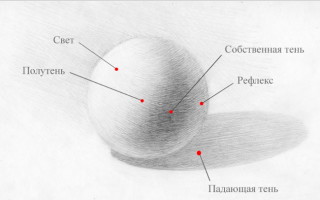
The distribution of light and shadow on everything that surrounds us in the world is called chiaroscuro.
Thanks to it, we see the volume of objects and understand their shape. The more accurately the relationship between light and shadow is conveyed, the more voluminous and lively the world we draw will look. Therefore, one of the primary tasks for an artist is the competent depiction of chiaroscuro. Chiaroscuro is divided into several tones with their own names and specific locations:
- The darkest place on an object is its own shadow.
- from the side where the light source is directly directed, the most illuminated part of the object is the light.
- the place of transition from one's own shadow to light is called penumbra, or artificial shadow. The light does not fall directly on this part, but passes through it casually.
- on the shadow side there is a reflex - this is reflected light.
- and the shadow cast by an object on other surfaces is called cast.
The simplest school example for analyzing chiaroscuro is geometric bodies of different shapes, that is, with rounded and straight surfaces. For clarity, I’ll take a cube, a ball and a cylinder. A silver spray can acts as a cylinder.
How to draw a cube with chiaroscuro
The simplest and most understandable chiaroscuro on the cube.
The cube has edges and break lines that separate the elements of light and shade from each other. Moreover, the greatest contrast and intensity of light and shadow is located precisely on these edges. Your own shadow is the brightest and most intense at the border with light; it gradually fades and turns into a reflex.
The light is also whitest and brightest at the edge of the shadow along the break line. And it also loses its intensity in the direction from the break line.
There is a penumbra on top of the cube. It is darkest on the border with light along the break line. And on the border with its own shadow, it is the opposite - light, the edge is directly illuminated, it is clean and white.
The falling shadow is always the darkest, darker than its own shadow. And it has the greatest blackness and intensity at the border with light and with the object. And it fades and brightens in the direction from the edge of the light.
On the back face of the cube, its own shadow is clearly brighter and denser than the falling one, which goes behind the cube and fades out. This is clearly visible in my drawing.
How to draw a ball with chiaroscuro
On the ball, all components of light and shade smoothly transition into one another.
There is a bright, clear reflection in the light and in general the ball looks gray in relation to it. Also, a reflex is clearly and clearly visible on the ball, which illuminates the ball from the shadow side.
But you always need to remember: the reflex is part of the shadow, so it can never be as light as the illuminated part of the ball and lighter than the penumbra. Sometimes it seems that the reflex glows brightly and in the drawing because of this there is a possibility of overdoing it with its glow. Therefore, you should always pay attention so that the reflex in your drawing is not confused with light; if this happens, then it must be extinguished.
The falling shadow is very dense and bright, the most intense is under the ball, where it comes into contact with the surface of the table. But just like a cube, the falling shadow goes behind the ball and brightens there.
The ball is glossy, so it has a bright reflection, and the spray can is also reflected on the shadow side.
This is what it looks like in my drawing. Pay attention to the shading, it follows the shape of the rounding of the ball, which gives it additional volume.
How to draw a cylinder with chiaroscuro.
The can, acting as a cylinder, has a shiny surface, so it is highly reflective and confuses the viewer - it is not entirely clear where its own shadow is, where the light is, how the penumbra goes, everything is in stripes.
But all the gradations of light and shade are clearly visible on the lid - it is matte.
Everything in the can is the same, only it looks more contrasting and striped, although on the shadow side there is another black stripe - a reflection of the falling shadow on the can.
Another stripe is a white stripe on its own shadow, this is reflected by the cube. But we will not delve into all the stripes in detail, so as not to fragment the shape, we need to show the chiaroscuro in general, so that the volume of the cylinder is visible.
The lid has a break line.
The most contrast is at the edge closest to the light. That is, the penumbra here is the same as on the cube - dark and contrasting at the border and smoothly diverges into a lighter tone. In the light there is a bright highlight at the very edge of the fracture, which fades towards the bottom.
The falling shadow has a small peculiarity here. It seems that it is lighter than its own, because the table is white and the spray can is gray. However, this is not the case everywhere. Under the can, at its base, the falling shadow is still darker than its own; the reflex adds a ton of contrast to it.
And this is how it all looks in pencil.
I always recommend adding a background even to the most basic academic work. This is a great practice for shading skills, plus the background emphasizes the light and shade on objects.
Light on dark, dark on light is an excellent rule for any pencil work with maximum expressiveness.
This means that you do not need to cover the entire background with tone; first of all, you should emphasize the light on the subject with the background, that is, add a background from the illuminated side, and do not touch it at all from the shadow side.
The can as a whole is gray, so there is no need to add a tone around it at all. Plus, it wouldn’t hurt to add a table break line - it adds space to the work, the objects immediately stand up, and not just abstractly hovering on the sheet.
Chiaroscuro transforms a flat linear pattern into a three-dimensional and lively one. Chiaroscuro on all other objects, absolutely any, with any surface has the same set of chiaroscuro elements and the same principles of distribution.
Therefore, in order to make three-dimensional, realistic drawings, to comprehend the theme of chiaroscuro, to learn how to convey it competently is the primary task for a beginning artist.
Basics of drawing on the site stabilo4k >
Light and shadow in painting
The volumetric shape of objects is conveyed in the drawing not only by surfaces constructed taking into account perspective cuts, but also with the help of chiaroscuro.
Light and shadow (chiaroscuro) are a very important means of depicting objects of reality, their volume and position in space.
Chiaroscuro, as well as perspective, has been used by artists for a very long time. Using this means, they learned to convey in drawing and painting the shape, volume, and texture of objects so convincingly that they seemed to come to life in the works. Light also helps convey the environment.
Artists to this day use the rules for the transmission of chiaroscuro discovered in the Middle Ages, but are working to improve and develop them.
We can change the light of artificial sources at our request, but natural lighting changes itself, for example, the sun either shines brightly or hides behind the clouds. When clouds scatter sunlight, the contrast between light and shadow softens, and the illumination in the light and shadows is evened out. Such calm lighting is called light-tonal lighting. It makes it possible to convey a greater number of halftones in a drawing.
There are many different states of sunlight that can greatly change the same landscape and even affect your mood. The landscape looks joyful in bright sunshine and sad on a gray day. In the early morning, when the sun is not high above the horizon and its rays glide across the surface of the earth, the contours of objects appear unclear, everything seems to be shrouded in haze. At midday, the contrasts of light and shadow are enhanced, bringing out details clearly. In the rays of the setting sun, nature can look mysterious and romantic, that is, the emotional impression of the landscape largely depends on the lighting.
The perception of color also depends largely on lighting. If with the help of linear perspective we convey space in a drawing, then in painting we cannot do without taking into account changes in the color and tonal relationships of nature as they move away from the viewer or the light source. Dark objects at a distance take on cold shades, usually bluish, and light objects take on warm shades.
The nature of illumination also depends on the height of the sun above the horizon. If it is high above your head, almost at the zenith, then objects cast short shadows. Form and texture are poorly revealed. When the sun decreases, the shadows of objects increase, the texture appears better, and the relief of the form is emphasized.
Knowing these patterns of light and shadow construction can help you when solving creative problems in depicting a landscape or thematic composition.
Now for some practice
The shadow is the darkest part of the object and is located on the side that is not illuminated.
Penumbra is the transition from light to shadow.
Reflex is reflected light and shades from neighboring objects.
Light is the illuminated part of an object.
A highlight is the brightest part of an object, illuminated more than the light on the object.
A cast shadow is the shadow of an object.
On an object there will always be a highlight, light, penumbra, shadow, reflex, falling shadow - and precisely in this sequence.
And you need to know that if the light is on the left, then the shadow will be on the right. If the light is on the right, then the light will be on the left.
Let's move on to an example. In the color and black and white example, the light will be on the left.
Step 1. First we draw the axis of symmetry and the base, then we outline the plane of the table.
Step 2. Using auxiliary lines, we build a cup and outline the ellipses.
Step 3. We complete the cup, draw a handle and complete the ellipses.
Step 4. The drawing is made with pastels. Using brown chalk, we outline a highlight, like the lightest spot on the object, then, using brown and orange chalk, we make a reflex on the right side of the cup. From the reflex we draw a shadow. The strokes will be denser.
First, we cover this area with a little blue, since the blue color is also a reflection from the blue drapery in the background, and it gives a reflection in the shadow on the subject. Then we apply brown and orange on top.
This creates the darkest area on the cup. Then we make penumbra from shadow to highlight. On top, make a light brown shadow inside the cup. Then we move to the handle and outline the shadow there too. On the right side of the table we draw a falling shadow and begin to shade the table with green chalk.
Step 5. We finish drawing the cup, finish drawing the light part, shade the tablecloth with green, and make the front part of the drapery more saturated green, since it is in the shadow. And we finish the background with blue.
In an even-white drawing you can also see how the transition from light to shadow occurs.
Chiaroscuro
The concept of chiaroscuro. Tone as a means of expressing three-dimensional form.
A person perceives the real shape of an object thanks to reflected light rays entering the eye. A light source, illuminating an object, determines not only its position in space, but also reveals the nature of its volumetric shape in accordance with its structural structure.
Since individual sections (surfaces) of a volumetric object are located at different angles to the light source, their degree of illumination is different. The latter is explained by the fact that they receive different amounts of light rays. The most illuminated parts, that is, the surfaces facing the light source and receiving the greatest flow of direct rays, are usually called light .
The illumination of the surface of an object decreases significantly as the angle of incidence of light rays decreases. Oblique (sliding) rays of light form penumbra on the surface. On rounded forms, the penumbra is a zone of gradual (smooth) transition from the light part to the shadow, and on faceted objects, the penumbra acts as an independent zone between its illuminated and shadow parts.
The shadow on an object is that part of the surface of the form on which the rays from the light source do not fall, and such a shadow is usually called its own shadow .
There is also a so-called falling shadow , formed on surfaces (on the illuminated part of the form, on the plane of the table, on the background, etc.) from illuminated objects blocking the path of the light flow. The nature of the outline of a falling shadow depends on the shape of the object forming this shadow, and on the structure of the surface and the design of the form on which it falls.
Objects, being in the environment, receive not only streams of rays from the light source, but also reflected rays of light from neighboring objects. If you look closely at nature, you can see that its shadow part is heterogeneous in its density. As a result of exposure to reflected light, the shadow itself is somewhat lightened in some places. This phenomenon is called the light reflex. As a rule, on objects of a round shape, the highlighting of its own shadow occurs in its extreme “contour” part, therefore, when drawing objects of this shape, the darkest part of its own shadow should be positioned slightly inward from the edge of the shadow part of the form, which is very important for solving the volume of the shadow part.
The lightest area of the illuminated surface of an object, reflecting the greatest number of rays of light, is called flare . It is best seen on glossy surfaces, especially convex and concave shapes. The figure shows a diagram of the distribution of light and shade on objects with faceted and round shapes.
Distribution of light and shade on faceted and rounded objects
So, there are certain patterns in the distribution of light rays according to the shape of an object, due to which our eye perceives different gradations of the light flux falling on its surface, and, consequently, the volumetric shape. On the basis of these objective laws, the concept of chiaroscuro in nature arises as a set of shades of light on the corresponding form from the lightest to the darkest.
At the same time, the degree of light and shadow saturation in nature depends on a number of objective conditions. If two objects similar in all respects (for example, two plaster balls) are illuminated by light sources of different strengths, then on the ball, which is illuminated by a stronger light source, the chiaroscuro will be more clearly expressed than on the ball, illuminated by a less strong source.
The strength of light and shadow is perceived differently on homogeneous objects occupying different spatial positions to the light source. This can be clearly seen in a full-scale setting of a group of geometric bodies illuminated by a single light source. The closer an object is located to a light source, the stronger and more contrasting the chiaroscuro is expressed on it in relation to the illuminated and shadow surfaces of objects located further from this light source.
The strength of chiaroscuro will be perceived differently on objects illuminated by the same light source, but different in color (for example, blue and brown teapots or red and green cups). This depends on the degree to which the object color reflects or absorbs the amount of light flux.
Thus, the strength of chiaroscuro depends not only on the strength of the light source and its distance to the object, but also on the color of its surface, that is, the strength of chiaroscuro depends on the ability to reflect a certain amount of light by one or another surface of the object. aperture ratio in nature arises .
The luminosity of individual elements of chiaroscuro (light, penumbra, shadow, reflex) in nature is in certain relationships. Thus, the reflex is always lighter than the shadow and darker than the light, the penumbra is darker than the light and lighter than the shadow, both its own and the falling one. In this case we are talking about an identically colored object.
However, students have to draw not only full-scale productions, the objects of which have a homogeneous material and the same color (such as a group of plaster geometric bodies), but also still lifes composed of household objects of different colors, including those with a different range of lightness of the same the same local color (for example, a blue teapot, a light blue cup, etc.).
In such full-scale productions, on the one hand, each object carries its own light-power relations, on the other hand, the light-power relations of one object (from light to dark) differ from the light-power relations of other objects.
By comparing the luminosity relationships between colored objects in a full-scale setting, one can detect not only the difference between one and the other in lightness (for example, a yellow lemon is lighter than a blue cup), but also the difference in the luminosity of the chiaroscuro elements. Thus, the intensity of the illuminated surface of one of the colored objects may be lighter or darker than the light parts of the others, and it may also be that the intensity of the shadow of one of the objects in a full-scale setting will be lighter than the penumbral surface of another object (under equal lighting conditions, the shadow part of a light yellow object will be lighter than the penumbral surfaces of objects having a dark blue or purple color).
Thus, the reflectivity of color significantly affects the light-power ratios of the degree of lightness of the elements of chiaroscuro between objects, and, consequently, the overall light-and-shadow structure of the full-scale setting.
The difference in the strength of light and shadow gradations in nature defines the concept of tone . By tone in a drawing we should understand the reproduction on the plane of a sheet of the light-and-shadow structure observed in nature from the lightest to the darkest, in other words, the reproduction of the light-power ratios of the surfaces that form the volume.
It should be noted that the artist, having at his disposal a pencil or charcoal, as the darkest visual materials, and white paper, cannot reproduce not only the absolute power of deep shadows and brightness of light, but also the richness of tonal shades that nature has at its disposal. And yet, despite the limited range of the tonal scale of visual materials, an experienced draftsman conveys in the drawing both the variety of light and shadow gradations on the corresponding forms, and the general light and shadow structure of the full-scale setting.
To overcome the contradiction between the range of the tonal structure of nature and the tonal scale of the visual material, the artist uses a tonal scale in the drawing, the essence of which is, on the one hand, to reduce the “stretch” of tonal shades when sculpting the form between the bordering light and shadow zones, on the other hand, to establish in the drawing the lightest and darkest places, within which all intermediate tones should be distributed. The limiting size of the tonal scale in a drawing is white paper and the full strength of the pencil, as the extreme poles.
Ideal course for beginners!
We learn to work with 5 art materials at once,